22 years!
Selfie of a man and a woman sitting on a sofa in a living room.

Random tangent (blog)
Ameel Khan's personal blog. This is a blog about life, technology, photography, typography, the internet, science, feminism, books, film, music, and whatever other random stuff I come across or happen to be interested in today.
22 years!
Selfie of a man and a woman sitting on a sofa in a living room.
It’s been a while since I did a photo walk in the city, so today I grabbed my trusty 40mm prime lens and walked a few blocks down Little Collins Street.
It was a hot, sunny, 30 degree day, but it was quite pleasant in the shade. And not only did I get a couple of decent photos, I also got to check out a half-assembled film set, which was fun :)
Photo of a dark green, classic Italian style, electric motorcycle parked on the pavement outside a building.
Photo of a dark green, classic Italian style, electric motorcycle parked on the pavement outside a building. The font of the motorcycle is in shadow of the building, but the back is brightly lit by the sun.
Photo through the shop window of a stack of paper coffee cups stacked neatly next to a coffee machine in a cafe. The ‘Five Points’ wordmark is stamped on each coffee cup.
Photo looking up at a powerful cinema light mounted on a crane. The light is covered by a large, lantern-shaped soft box, which is a box made out of white cloth that softens the light that's coming from the LED bulbs.
Photo of a white Ford sedan parked on the side of a narrow city road in Melbourne, Australia that will eventually become a film set. An orange crane with cinema lights mounted on top of it is parked behind this car. There are lights on top of this car that identify it as an American police vehicle. Blue stickers pasted on the car read, “NYPD Police”.
Unlike last year’s Australian Open tennis tournament – during which there was a thunderstorm – this year’s tournament featured two heatwaves.
¯\_(ツ)_/¯
We were there during the second of those heatwaves, but we took good care of ourselves :)
Here are my photos from this year’s tournament.
Selfie of a man and a woman sitting outside a tennis complex on a sunny day. The man is wearing a black t-shirt and glasses; the woman is wearing a black sleeveless top and sunglasses. They are both wearing straw hats.
Wide-angle photo of an outdoor tennis court at a tennis tournament. The tennis court has seating all around, and shading has been erected so that almost all the seats are in the shade. The blue-coloured tennis court is empty because the next scheduled match has not yet started.
Photo of professional tennis player Hanyu Guo (China) in the air while in the middle of her tennis serve. The players are playing in a tennis court with a hard, blue coloured surface.
Photo of five women sitting in a row in the stands of a tennis court during a tournament. They are all wearing identical, patterned green-and-yellow tops as well as green straw hats with a yellow tennis ball affixed to the top.
Photo of the signage at the top of the Rod Laver Arena tennis court, as seem from the stands of a nearby outdoor tennis court.
Photo of a ball kid in blue shorts, a blue shirt, and a blue hat stopping his run across a blue-coloured tennis court as he approaches a tennis ball lying on the ground.
Photo of a ball kid in blue shorts, a blue shirt, and a blue hat running back across a blue-coloured tennis court after he has retrieved the tennis ball that was lying on the ground.
Photo of a ball kid in blue shorts, a blue shirt, and a blue hat rolling tennis balls across a blue-coloured tennis court to another ball kid that’s off-camera.
Photo of a ball kid holding up a tennis ball in case the serving tennis player wants another ball. Only the top of the ball kid’s hat at the ball kid’s arm are visible, with the rest being blocked from view by the wall of the tennis court.
Photo of professional tennis player Talia Gibson (Australia) tossing a tennis ball in the air at the start of her serve during a tennis match.
Photo of professional tennis player Talia Gibson (Australia) mid-swing as she prepares to strike a tennis ball during her women’s doubles match.
Photo of professional tennis player Sara Errani (Italy) as she hits a ball into the opposing court during a tennis match.
Photo of a ball kid waiting by the side of the net at a tennis tournament. In the background of the photo professional tennis player Kimbery Birrell (Australia) prepares to serve.
Let’s talk about monospaced typefaces.
One of the only places normies will read anything in a monospaced typeface these days is when they buy something from a store and they get a long paper receipt from a point-of-sale machine (aka cash register).
Screenshot of a digital receipt from Australian retailer JB Hi-Fi for a Microsoft Surface laptop and pen. The typeface used here is Courier.
There are, however, two groups of people who still frequently use monospace typefaces.
The first group is software programmers and computer nerds like me.
We read and write things in plain text files (software code, system configurations, etc) and we use our computer’s command line all the time, both of which use a monospace typeface by default.
Screenshot of a computer’s command line showing the list of files in a directory (aka folder). The typeface used here is Hack.
The second group is folks who work in the film and television industry, as well as film nerds like me.
We work with – or, in my case, just read – screenplays all the time, and virtually all of those are written in a monospace typeface. (At least all the screenplays written in the Latin script.)
The font used in these screenplays is almost always 12pt Courier, Courier Prime (which was designed specifically for screenplays), or Courier Sans Mono.
Screenshot of the screenplay to the film ‘Sinners’ by Ryan Coogler. Source: SimplyScripts. The typeface used here is Courier.
Even though most of us rarely use monospace typefaces in our daily lives, the impact that geekdom and filmdom have had on popular culture means that there’s an “old-school cool” aesthetic about using monospace typefaces.
Of course this is also partly because Courier was the typeface used by IBM Selectric typewriters, and that was the typewriter of choice for many famous authors and journalists from the 1960s onwards.
‘Thomson and his typewriter’ (Source). Photo of American author and journalist Hunter S. Thomson standing calf-deep in snow outside his cabin in Aspen, Colorado, USA in 1989. Thomson is wearing blue jeans, a blue jacket, and a brown fedora hat. He is pointing a silver handgun at beige coloured IBM Selectric typewriter lying on the snow a short distance away from him.
All that to say there are still plenty of monospace typefaces being designed and published every year. And some techie/nerdy websites and blogs also continue to use monospace typefaces for their body text and headings – like Cory Doctorow’s Pluralistic, which uses your browser/computer’s default monospace typeface in all its text elements.
This brings me to the fun convergence that is the topic of this post, where we have two type designers who approached the monospace-typeface aesthetic from opposite directions.
In 2021, Owen Earl from indestructable type* published the Drafting* Mono typeface.
This monospace typeface is a gloriously “weird, wildly inconsistent” serif/sans-serif hybrid that “[imitates] the spirit of typewriters, not the literal look”.
Basically, this is a typewriter-inspired, monospaced typeface that has the aesthetic of proportional typefaces (aka variable-width typefaces).
Meaning this typeface functions like a monospace typeface but reads like the regular serif/sans-serif typefaces we’re used to seeing every day.
Graphic showing the first two paragraphs of Alice’s Adventure in Wonderland by Lewis Carol set in the Courier Prime and Drafting* Mono typefaces.
In 2024, Pedro Arilla from Arillatype.Studio published the At Textual typeface.
This is a typeface that “draws inspiration from the texture, readability, and honest utilitarianism of monospaced fonts”.
Basically, this is a proportional typeface that has the aesthetic of monospaced typefaces.
Meaning this typeface functions like a proportional typeface, but reads like the monospace typefaces you see in text files and film scripts.
Graphic showing the first two paragraphs of Alice’s Adventure in Wonderland by Lewis Carol set in the Courier Prime and At Textual typefaces.
I love that the two designers started from completely opposite directions (and largely remained within their respective lanes) but they both ended up converging around the idea that the monospace typeface aesthetic is cool, even in body text applications, and that they should do something about it :)
By the way, if you’re after a monospace typewriter aesthetic but Courier and Drafting* Mono are too plain and neutral for you, check out Clack by Matthew Hinders-Anderson.
Graphic showing the phrase “Rabbit hole” set in the Courier Prime, Drafting* Mono, At Textual, and Clack typefaces. The text set Courier Prime is flagged as being standard and neutral; the text set in Drafting* Mono is flagged as being stylish and quirky; the text set in At Textual is flagged as being stylish and proportionally-spaced; and the text set in Clack (Medium) is flagged as being elegant.
Clack is a lovely interpretation of the typefaces found on IBM Selectric typewriters (ie Courier and its variations) and is great for reading and writing text. It has weights that range from thin to black, and it has italics (which not all typewriter-inspired typefaces have, fyi) so it has a super versatile set of fonts as well.
Graphic showing the first two paragraphs of Alice’s Adventure in Wonderland by Lewis Carol set in the Courier Prime and Clack typefaces.
The only catch with all of Hinders-Anderson’s typefaces is that, while they’re free for anyone to use, they can only be used for non-commercial purposes.
This is why, for example, design agency Forge could use Hinders-Anderson’s Union Gothic typeface for the 2025 ‘Zohran for NYC’ campaign, but no brand can use that typeface for any commercial purpose – which I think is really cool :)
Screenshot from the Zohran for NYC campaign website showing headings set in the Union Gothic sans serif typeface.
That’s all I have to say about monospace typefaces today.
Though, if you want, you can check out my December 2025 list of favourite typefaces in which I include my favourite monospace typefaces towards the end.
Do you have any favourite monospaced typefaces? I’d love to know what they are. Especially the ones you use for writing text, not just code.
Time for another instalment of my cool type-pairing series, this one featuring a range of online publications.
You can build an excellent website using just free typefaces if you pair them well, which is what Ars Technica has done.
This site uses Source Sans 3 (Adobe, Paul D Hunt) for body text, Faustina (Omnibus-Type) for headings, and Exo 2 (Natanael Gama) for bylines and metadata. All of which help make this website look modern and serious/authoritative.
Screenshot from the Ars Technica website of an article titled, “A quirky guide to myths and lore based in actual science”.
Source Sans 3 and Faustina are both on my most recent (Dec 2025) favourite typefaces list, by the way :)
While Ars Technica’s style is that of a modern, web-only publication, Semafor’s style is very classic newspaper/magazine, though also one that’s web-only. In fact, its two main typefaces were both originally designed for magazines that were published by the New York Times.
This website uses Lyon Text (Commercial Type) for body text and Feature Flat Display (Commercial Type) for its headings. Oh, and it uses good old Helvetica for its metadata, captions, menus, etc.
Screenshot from the Semafor website of an article titled, “Semafor Tech’s predictions for 2026”.
Sticking with websites that use modernised classic typography, let’s look at Hodinkee.
Hodinkee uses mostly the Portrait typeface family (Commercial Type): Portrait Text for body text, Portrait Regular for headings, and Portrait Inline Sans for the article category (ie the “Essays” that’s in all-caps in the screenshot below). Portrait is a minimalist, screen-friendly interpretation of French Renaissance typefaces like Garamond.
The site also uses Brown (Shinntype) for bylines and metadata and Proxima Nova (Mark Simonson) for the headings and metadata in the comments section.
Screenshot from the Hodinkee website of an article titled, “An Exciting 2026 And A Push For More In 2026”.
Let’s end on a website that uses two of my favourite typefaces, the website in question being the venerable Harvard Business Review (HBR).
HBR’s website uses Tiempos Text (Klim Type Foundry) for body text and GT America (Grilli Type) for headings and everything else (metadata, menus, captions, etc).
Screenshot from the Harvard Business Review website of an article titled, “Don’t Underestimate the Value of Professional Friendships”.
Tiempos Text is a modernisation of typefaces like Plantin and Times (the Linotype interpretation of Times New Roman that’s available on macOS). Times New Roman itself is based on Plantin.
According to its designers, GT America is “the missing bridge between 19th century American Gothics and 20th century European Neo-Grotesk typefaces” – meaning it takes the best design features from American typefaces like Franklin Gothic and European typefaces like Helvetica and Univers.
Both Tiempos Text and GT America are really cool. And also really expensive. <sigh>
After focusing on large publications in this instalment, I think I’ll focus on personal blogs in my next cool type-pairing post.
Two of my all-time favourite sans serif typefaces are Frutiger and Avenir, both of which were created by Adrian Frutiger.
I’ve already written an extensive post about my recommended Frutiger alternatives, but here’s a quick run-down of my favourite Avenir alternatives.
Two reasons.
A single-user, desktop-only licence to Avenir Next costs AU$1,520.
So if you don’t already have access to Avenir through some other means, then you’ll want a free or more affordable alternative.
Of course if you’re a macOS user, then this reason won’t apply to you since you already have all of Avenir and Avenir Next pre-installed in your operating system.
If you only have access to Avenir through a Microsoft 365 subscription, though, this second reason might apply to you.
That’s because the Avenir fonts included with the Microsoft Office suite are:
Avenir Next Light + Italic
Avenir Next Regular + Italic
Avenir Next Demi Bold + Italic
Avenir Next Bold + Italic
The problem with this is that the Regular weight of Avenir is quite light, so if you’re using it as a text font – especially at smaller sizes – it’s not the easiest to read on screens.
Compare the text below set in Avenir Next Regular (on the left) and Helvetica Neue Regular (on the right). The text on the left does look a little more elegant, yes – since lighter typefaces tend to look more elegant anyway – but the text on the right is easier to read.
macOS users don’t have this problem because they can just use the Medium weight of Avenir Next instead – like in the graphic below where both columns are easily readable.
None of these are copies of the Avenir, of course, so you won’t get all its design quirks – like the horizontal tail of the uppercase ‘Q’ – but they all have a vibe that’s similar to Avenir’s.
Hint doesn’t have the 1920s luxury feel of Avenir (with its tall and narrow letterforms) but it does have a more “quiet luxury” feel about it.
Sailec is billed as a “totally neutral” typeface, but it has much more style than Helvetica, for example, and is a good, albeit somewhat muted, alternative to Avenir.
My favourite free alternatives to Avenir are Figtree from Eric Kennedy and Montserrat from Julieta Ulanovsky and others.
A more neutral, but still somewhat elegant, alternative is Poppins from Indian Type Foundry.
Of these, Montserrat has the most interesting uppercase ‘Q’ but I think Figtree is a better overall alternative for use on screens.
According to its designer, Figtree’s vibe walks the line between “simplicity and friendliness” so it doesn’t quite have the elegant vibe you get from Avenir. But because many of its its letterforms are so similar to Avenir’s, it does work as a decent alternative.
It’s probably more accurate to say that Figtree is a good alternative to Frutiger, by the way – and perhaps a version of Frutiger that leans more towards the elegance of Avenir.
Montserrat has a stylish/elegant vibe, but its letterforms are both larger and wider than Avenir’s – which makes sense, given Montserrat’s inspiration came from old posters and signs in the Montserrat neighbourhood of Buenos Aires. Still, it’s a pretty decent alternative to Avenir.
I love Avenir and use it whenever I can (eg in presentations and in printed letters), but if I want an elegant typeface for body text font use on screens, then Hint is what I end up using most of the time.
I created a video [YouTube, 14:35min] about the typefaces I recommend when people tell me they’re bored of (usually) Arial and they want me to suggest a more interesting font that still looks professional.
However, I hate it when content is video-locked (ie available only in video format) so here are the key bits from that video in text form.
There are two reasons you could be looking for an alternative to Arial and Helvetica:
Same-same: You want a typeface that’s very similar to Arial and Helvetica. Maybe because you prefer a typeface with an open licence or one with a less expensive and less restrictive licence. Or maybe you just don’t have access to Arial and Helvetica and you want to use a drop-in replacement.
Different: You want something slightly different from Arial and Helvetica, though you still want this typeface to have an overall neutral-ish vibe.
I have recommendations for you either way.
There are a lot of typefaces that are very similar to Arial and Helvetica, but these are the ones I usually recommend.
These are my two free recommendations:
Arimo from Google Fonts
Nimbus Sans L from URW++
I actually prefer Arimo over Arial for everyday use because I think Arimo looks better on screens: it has a slightly taller x-height, more open apertures, and a little more character overall. Check out the The Register website to see how good Arimo can look on a text-heavy website.
I also prefer Nimbus Sans over Helvetica because a commercial licence to Helvetica (ie not just the personal licence you get with macOS) is quite expensive.
Before you ask, I’m not a huge fan of Liberation Sans (from Red Hat) so that’s not a typeface I’d recommend.
These are my four paid recommendations [1]:
Neue Haas Grotesk Text (and Display) from Commercial type
Untitled Sans from Klim Type Foundry
Neutral from Typotheque
Suisse Int’l from Swiss Typefaces
For those of you who skipped my video on this topic [YouTube, 14:35min] these are the not-so-neutral, sans serif typefaces I recommend:
These are my four free recommendations:
Inter (and Inter Display) from Rasmus Andersson – also available from Google Fonts, though there these are called Inter and Inter Tight, respectively
Public Sans from USWDS – currently supports only the Latin writing system
Officer Sans Free from HvD FONTS – also has a paid version (more font weights + condensed versions)
Nebula Sans from Nebula – currently supports only the Latin writing system
Officer Sans was designed to be metrically compatible with Arial and Helvetica and I use this my default spreadsheet font.
When I need to write text in a neutral-ish, sans serif typeface, though – like a formal letter – its usually a toss-up between Public Sans and Officer Sans. [2]
These are my four paid recommendations [1]:
Aktiv Grotesk from Dalton Maag
Neue Montreal from Pangram Pangram
Phonic from Schick Toikka
Brenner Sans from Typotheque
If you want to know why I recommend these typefaces out of all the other ones that out there, you should watch my video.
I also have two honourable mentions:
Roboto is used everywhere on the web but I don’t see it being used very often in documents and presentations, so this might be an interesting alternative to consider.
I love Unica as a typeface, but I much prefer Lineto’s Unica77 over Linotype’s Neue Haas Unica (which, as it happens, I do have a licence to). Unfortunately, Unica77 is very expensive. That’s why I only have it under a trial licence and why it’s an honourable mention and not a full-on recommendation. <sigh>
Do you have a go-to neutral sans serif typeface that you’d recommend to others? Let me know.
FYI, the text used in the comparison-graphics above is from the opening sentences of The Rook by Daniel O’Malley.
[1] Whenever possible, I recommend typefaces from only indepenedent, interesting, or otherwise notable type foundries.
[2] As its designer, Dan Williams, mentioned in an interview, Public Sans pairs really well with Georgia (or with Gelasio, which is the Google Fonts alternative to Georgia).
Nadia and I have been enjoying our time off during the year-end break, going on walks around various parts of the northern suburbs of Melbourne.
Close-up photo of the back and side of a woman’s head and shoulders. The woman is wearing a black hoodie and a cyan 2020 ICC Cricket World Cup cap. Out of focus, in the background of the photo, is a neighbourhood football pitch.
Photo of the back and side of a woman’s head and shoulders. The woman is wearing a black hoodie and a cyan 2020 ICC Cricket World Cup cap. Out of focus, in the background of the photo, is a neighbourhood football pitch.
Photo of the valley of a suburban river with a rail bridge crossing over it. A plane spotter is leaning against a wire fence that runs down the decline of the valley. A camera mounted on a tripod in set up in front of him.
Photo of a railway viaduct built across a creek’s valley and flood plain. The viaduct comprises steel girders supported by steel-framed towers. Behind the viaduct is the residential suburb of Gowanbrae.
Photo of the top of a steel-frame tower that is supporting a rain bridge, also built out of steel girders.
Photo of a railway viaduct built across a creek’s valley and flood plain. The viaduct comprises steel girders supported by steel-framed towers. Behind the viaduct is the residential suburb of Gowanbrae.
Photo of a railway viaduct built across a creek’s valley and flood plain. The viaduct comprises steel girders supported by steel-framed towers.
Photo looking up along the length of a steel-frame tower that is supporting a rain bridge, also built out of steel girders.
Photo looking up at a blue-and-white Victoria Police helicopter hovering in the air above a residential suburb. Several tree branches and leaves can be seen in the foreground of the photo.
Photo of a woman walking a black dog along a trail that runs alongside a suburban river.
Photo looking up, along an incline, at a railway viaduct built across a creek’s valley and flood plain. The viaduct comprises steel girders supported by steel-framed towers.
Photo of a young boy riding a wheeled children’s sled down a cemented walking/cycling path that descends into a suburban valley.
Photo of a young boy riding a wheeled children’s sled down a cemented walking/cycling path that descends into a suburban valley. The boy is leaning hard to one side so that he can follow the sharp curve of the path.
Photo of a walking/cycling path that goes up a suburban valley. The path is surrounded by trees on both sides. In the background of the photo a railway bridge can be seen crossing the valley.
Photo of a walking/cycling path that goes up a suburban valley. The path is surrounded by grass and trees. By the side of the path is a hairpin-turn sign for cyclists. In the background of the photo a railway bridge can be seen crossing the valley.
Photo of a railway viaduct built across a creek’s valley and flood plain, which is the Kingsford Smith Ulm Reserve. The viaduct comprises steel girders supported by steel-framed towers. Behind the viaduct is the residential suburb of Gowanbrae.
Photo of the back of a woman holding up her smartphone to take a photo. The woman is looking to her left to make sure she isn’t in the path of a cyclist. Her long, black hair is in a ponytail and she is wearing a brown sweatshirt and a cyan 2020 ICC Cricket World Cup cap. In front of her are the trees and bushes growing along the side of a suburban valley.
Low-angle photo of a walking/cycling path that goes up a suburban valley. At the end of this long stretch of path is a hairpin-turn sign for cyclists.
Photo of several brown turtles swimming along the banks of a large pond.
Photo of a brown turtle swimming in a pond, with its head poking out of the water.
Photo of two brown turtles swimming in a pond, one with its head poking out of the water and the other swimming completely underwater.
[NOTE: The most up-to-date version of this list is always on the ‘Typography’ page.]
The end of the year is a good time for me to update my list of favourite typefaces.
Since my last update in December 2024, I have:
bought a bunch of new typefaces (yay sales!), and
used a bunch of typefaces in various creative projects.
As a reminder, the typefaces below are grouped by their level of formality (‘How I think about typefaces’) and are sorted in decreasing order of versatility (ie how easy they are to use in different types of projects).
Casual: Literata (free); Merriweather (free); Bitter (free); Bookerly (free); Vollkorn (free)
Chill (formal): Novela (pay what you want); Sentient (free); Sentinel
Neutral (formal): Source Serif 4 (free); Charis (free); Mercury; Malabar; Sabon Next (included with Microsoft Office); TT Jenevers; Crimson (free)
Stylish (formal): Calluna; Goodchild (and Nicholas); Audela; Blacker; Writer; Quador (and Quador Display); Editorial New
Elegant: Stempel Garamond; EB Garamond
Friendly: FiraGO (free) or Fira Sans (free); Gill Sans; SideNote; Nudica (pay what you want)
Casual: Work Sans (free); Inclusive Sans (free); Ideal Sans; Woodford Bourne
Chill (formal): Public Sans (free); Source Sans 3 (free); Trade Gothic Next (included with Microsoft Office); Nebula Sans (free); Fact; Mozer; Bebas Neue
Neutral (formal): Neue Montreal; Brother 1816; Roboto (free); Inter (free); Chivo; Rig Sans; Verdana (included with Microsoft Windows, macOS)
Stylish (formal): Whitney; Calluna Sans; Officer Sans (basic set is free); General Sans (free); Cooper Hewitt (free); DIN Next; Jost* (free); Klima (free, but non-commercial use only); At Hauss; At Textual; URW Dock; URW DIN
Elegant: Hint; Figtree (free); Avenir Next (included with Microsoft Office)
Casual: Merriweather (free); Literata (free); Bookerly (free); Bitter (free)
Chill (formal): Zilla Slab (free); Charis (free)
Neutral (formal): Roboto Slab (free); Faustina (free)
Stylish (formal): Drafting* Mono (free); Klinic Slab (pay what you want); Manuale (free)
Elegant: Sentinel
Friendly: Nudica Mono (pay what you want)
Casual: Fira Mono (free)
Chill (formal): JetBrains Mono (free)
Neutral (formal): Source Code Pro (free); Hack (free); Inconsolata (free)
Stylish (formal): Neue Montreal Mono; Drafting* Mono (free); Cascadia Code (free)
Elegant: Berkeley Mono; Clack (free, but non-commercial use only)
Friendly: (none right now)
Casual: IvyStyle Typewriter
Chill (formal): Myriad; IvyStyle Sans; IvyGothic
Neutral (formal): Untitled Sans; Untitled Serif; Tiempos Text; Equity Text
Stylish (formal): Chaparral; IvyJournal; Tofino; Mackinac
Elegant: Bodoni Egyptian; IvyOra
What are your favourite or go-to typefaces? I’d love to know.
Here are some photos I took in the southern, eastern, and northern suburbs of Melbourne over the last couple of weeks.
Photo of an almost completely empty bottle of Jack Daniel’s Tennessee Whiskey lying on a stone wall around a public park in a suburb of Melbourne.
Photo of a triangular, bare metal mailbox outside a house. The mailbox looks like a creature’s head, complete with holes for eyes and the mail slot as its mouth.
Photo of a triangular, bare metal mailbox outside a house. The mailbox looks like a creature’s head, complete with holes for eyes and the mail slot as its mouth.
Photo looking up, through the leaf-filled branches of a tree, to an elevated train track and train station platform. A blue, silver, and yellow coloured train has stopped at this platform.
Photo looking down the length of a pair of elevated train tracks being held up by massive concrete pillars. This area under the tracks is a parking lot, which is almost full of parked cars.
Photo of a stone bench around next to some bushes underneath an elevated train station. Next to the bench is a metal drinking-water fountain. On the floor, next to the fountain, is a bright blue water bowl for dogs.
Photo of a vibrantly coloured mural showing fantastical characters that resemble frogs, flies, and other insects. These characters are taken from Anthony Breslin’s children's book Brezania.
Photo of a vibrantly coloured mural showing fantastical characters that resemble frogs, flies, and other insects. These characters are taken from Anthony Breslin’s children's book Brezania.
Photo looking straight up along the pole of a traffic light that’s located underneath an elevated railway station.
Photo taken from the seat level of an outdoor bench at the intersection of two suburban streets.
Black-and-white photo of over a dozen post office boxes, each with an embossed Australia Post logo, a keyhole, and a PO box number.
Photo of a sticker on the back of a sign that's on a bicycle path. This bicycle path is about to cross a suburban road. The sticker contains and QR code and text that reads, “Had a collision, but didn’t need to call the cops? Report it to Merri-bek Council! It takes 1 minute and helps identify hot spots. Scan me.”
Photo of a two large plastic bottles filled with a dark liquid and a few small plants in plastic pots placed on top of a residential wall. A hand painted sign on what looks like a wooden chopping board reads, “Share the love of Gardening. Please take”, followed by a smiley face.
Are you, like me, are bored of using the default, neutral, sans serif typefaces that came preinstalled with your word processor?
I made a video about the four free and four paid alternative typefaces I recommend you use instead.
FYI, I use Public Sans all the time and Officer Sans is my default spreadsheet font.
This is now my third typography explainer video. The long gap between the first two videos and this one is because first I got struck down by post-viral fatigue and then life and work both got super busy. Oh well.
Cooper Hewitt (used in the video titles and text)
Inter (Rasmus Andersson)
Inter (Google Fonts)
Public Sans (USWDS)
Officer Sans – Free (HvD FONTS)
Officer Sans – Paid (HvD FONTS)
Nebula Sans (Nebula)
Aktiv Grotesk (Dalton Maag)
Neue Montreal (Pangram Pangram)
Phonic (Schick Toikka)
Brenner Sans (Typotheque)
Roboto (Google Fonts)
Unica77 (Lineto)
Checkmark SVG Vector icon, Konstantin Filatov, SVG Repo, retrieved 26 Nov 2025
Close SVG Vector icon, Konstantin Filatov, SVG Repo, retrieved 26 Nov 2025
Gentlecons Interface Icons Collection for all the arrow icons, Konstantin Filatov, SVG Repo, retrieved 26 Nov 2025
A person sitting at a desk with a laptop photo, Francis Odeyemi, Unsplash, retrieved 30 Nov 2025
Person using Macbook Pro on brown wooden table photo, Slidebean, Unsplash, retrieved 30 Nov 2025
Black flat screen computer monitor photo, Josh Miller, Unsplash, retrieved 30 Nov 2025
“Ford’s better ideas for sale” ad (1967) image, Bart Solenthaler, Fonts In Use, retrieved 3 Dec 2025
Thorlo (2023 rebrand) ad image, Elizabeth Goodspeed, Fonts In Use, retrieved 3 Dec 2025
Two recent comments on my online content made me laugh out loud and then feel a little sad about the state of the world. After that I shrugged and moved on my with my life, though I did want to document these comments here so I could have a little chuckle about them in the future as well.
A little over a year ago I published a video on YouTube in which I urged people to stop using the Times New Roman typeface and, instead, use a serif typeface that was designed to work well on modern, high-resolution screens.
Screenshot of a YouTube video titled, ‘Stop using Times New Roman’.
This video performed well, receiving over 4,000 views on YouTube, and it got lots of good comments too.
But a couple of days ago a user named @DoodiePunk posted this comment under that video:
Replacing Times New Roman with Calibri was the biggest fail and I’m glad the U.S. government reverted its decision.
Screenshot of a comment under a YouTube video from a user named DoodiePunk that reads, “Replacing Times New Roman with Calibri was the biggest fail and I’m glad the U.S. government reverted its decision.”
This confused me because, at no point in my video had I talked about Calibri as an alternative to Times New Roman and I certainly hadn’t mentioned the United States Government.
It was only later, when I caught up on the day’s news, that I understood what this comment was referencing:
Screenshot from the ABC News Australia website with the headline, “Marco Rubio orders US State Department to revert to Times New Roman font, calling Calibri adoption ‘wasteful’”.
The ABC summarised this news article as follows:
US Secretary of State Marco Rubio says his predecessor’s switch to Calibri for official documents had been “another wasteful DEIA program” and the font was too informal.
In 2023, the State Department said Calibri was a more accessible font for people with disabilities.
The Trump administration has been eradicating federal programs promoting diversity, equity, inclusion and accessibility.
I’m not sure how @DoodiePunk got to my video about Times New Roman. Most likely they:
saw some other YouTube video about this news item and then got recommended my video at the end of it,
saw that my video was titled ‘Stop using Times New Roman’,
didn’t watch my video, but assumed I was supportive of the current US administration’s anti-DEI initiatives, and
felt the need to share their thoughts with me.
¯\_(ツ)_/¯
About a month ago I published a post about an aggressive business development person from Monotype who tried to get my employer to purchase font licences we didn’t actually need to buy.
This post was featured on the front page of Hacker News and, as a result, has received over 10,000 views so far.
One of the comments on Hacker News from a user named @liquidise really cracked me up:
I’m not typically sensitive to AI-sounding text but those image captions leave me understanding others’ issues with it.
Screenshot of a comment from user liquidise that reads, “I’m not typically sensitive to AI-sounding text but those image captions leave me understanding others’ issues with it.” A reply to this comment from user hibbelig reads, “It sounded like something a screen reader would say to help visually impaired visitors. But I don’t actually have a clue what screen readers do say.”
I found this comment really funny because @liquidise has it completely the other way around: large language models learned how to write from people who describe things well!
After I stopped chuckling, I found that I was quite chuffed about what @liquidise had said. Without realising it, they’d basically said I wrote good, neutral, descriptive captions for all the images I’d included in my blog post. Yay!
While I was briefly saddened by the polarisation and lack of knowledge inadvertently expressed by @DoodiePunk and @liquidise, I’m happier to just focus on the humour of the situation and move on my with my life. Which is what I’ll do now.
Two quick things before I go, though.
Here’s an excellent infographic on how to write good alt text for all your digital images. This was created by the UK digital agency Puzzle for its 2022 #AccessAlt campaign.
An infographic titled “How To Write Alt Text” featuring a photo of a capybara in a pool of water with a yellow-coloured yuzu balanced on top of its head. Parts of alt text are divided by color: identify who, expression, description, colour, and interesting features. The finished image description reads, “A capybara looking relaxed in a hot spa. Yellow yuzu fruits are floating in the water, and one is balanced on the top of the capybara’s head.”
This infographic has made its way around Mastodon several times, but it was originally referenced and archived by Veronica Lewis on her website.
Author and photographer Marcus Olang’ wrote an excellent edition of his newsletter titled, ‘I’m Kenyan. I Don’t Write Like ChatGPT. ChatGPT Writes Like Me.’
It was reading Marcus’s piece that prompted me to write this post today.
If you are not clear about why generative artificial intelligence chatbots like ChatGPT (that are trained using large language models) generate text the way they do, you should read this article.
This is the second post in my cool type-pairing series in which I’ll be sharing, well, the cool typeface pairings I see on the web.
The site on which I read the most amount of text is NewsBlur, the news reader/feed aggregator that I switched to when Google Reader was unceremoniously killed off in 2013.
It was here that I first came across Whitney (Hoefler&Co), which to this day remains one of my all-time favourite typefaces. That’s the typeface I use on NewsBlur to read all my news feeds.
Screenshot from the NewsBlur website of an article titled, “How China cleaned up its air pollution - and what that meant for the climate”.
Whitney was originally created in the late 1990s for the Whitney Museum in New York, USA. Designed for both wayfinding and editorial uses (ie for physical signs and for using as body text), it draws from the functionality of Frutiger (another one of my all-time favourite typefaces) and the structure of various American gothics, such as News Gothic.
Speaking of typography from Hoefler&Co, Rands in Repose uses one of my favourite typographic pairings: Ideal Sans (Hoefler&Co) for body text and Sentinel (Hoefler&Co) for headings.
Screenshot from the Rands in Repose blog of a post titled, “The Loop”.
Ideal Sans is a fun typeface with almost no straight lines and very few symmetries across its design. Sentinel is a modern take on a classical slab serif typeface. The two work brilliantly together.
Moving away from expensive typefaces, let’s look at The Conversation since this website uses typefaces that are available for free under the SIL Open Font License.
This website uses Libre Baskerville (Impallari Type) for body text and Montserrat (Julieta Ulanovsky, Sol Matas, Juan Pablo del Peral, Jacques Le Bailly ) for headings. For everything else (byline, metadata, navigation, footer, etc) it uses your browser’s default sans serif font.
Screenshot from The Conversation website of an article titled, “How China cleaned up its air pollution - and what that meant for the climate”.
Libre Baskerville is an open-source, screen-optimised adaptation of the original 1775 Baskerville typeface. It looks authoritative, yet approachable. Montserrat is a geometric typeface by Julieta Ulanovsky that’s based on posters, signs, and windows from the historic Montserrat neighbourhood of Buenos Aires. Both typefaces are a little large and a little wide, and they work really well together.
Finally let’s look at the ABC News (Australia) website which uses the bespoke typefaces ABC Sans Nova for its body text and ABC Serif for its headings – both designed by Australian Type Foundry.
Screenshot from the ABC News website of an article titled, “First Hike Project helps refugees experience hiking in Australia’s bushland for the first time”.
You can download these fonts from the ABC News GitHub instance. Since all of ABC News’ other GitHub work is available under the MIT licence, I suspect these fonts have been made available under that licence as well – though that isn’t spelled out on the download page itself.
The ABC superfamily of typefaces is friendly and easy to read on screens, and helps maintain the reputation of the most trusted news source in Australia.
Let me know if you have any favourite website typeface pairings. I’d love to check them out.
Back on my go-to 40mm lens, I took these photos as I walked along the Jim Stynes Bridge on the Yarra River.
It was a hot, sunny day as I walked to my car after my team’s year-end lunch at the newly-opened 1 Hotel Melbourne.
Photo of some metal-and-wood outdoor furniture that almost looks like a still-life painting. The photo shows a tall, narrow, black table with two tall, dark-green chairs arranged on either side of it.
Photo of some metal-and-wood outdoor furniture that almost looks like a still-life painting. The furniture has been placed in the ‘Seafarers Event Space’ outside 1 Hotel Melbourne. This space consists of an outdoor wooden deck constructed around a historic, bare-concrete building. The furniture is a tall, narrow, black table with two tall, dark-green chairs arranged on either side of it.
Black-and-white photo of a wide, urban river with a bridge running across it. Immediately in front of the photographer, along the near bank of the river, is a sturdy mooring bollard, next to which is a metal ladder leading down to the river level.
Photo of a curved, wood-and-metal, pedestrian and cyclist bridge that runs along the length of an urban river. The walkway and cycle path along the river have been interrupted by a road bridge that spans the river. This pedestrian and cyclist bridge connects these interrupted paths via a curved section that goes below the road bridge.
Photo of a cityscape taken from a pedestrian and cyclist bridge that runs below a road bridge that spans an urban river.
Photo of a warning sign underneath a road bridge that spans a river. The sign under the bridge reads, “Danger, foul ground below” and shows two arrows pointing down into the water.
Black-and-white photo of a cyclist and pedestrian walking on a bridge underneath another bridge that spans an urban river.
I finally got the chance to use make the most of my new wide-angle lens when I walked along the Yarra River after work one afternoon.
Photo of cafe/bar seating area outside a central business district/downtown building complex. There are several tall tables arranged in an outdoor courtyard, each with several stools and a large umbrella (currently tied down).
Photo looking up through a spiral staircase leading to an upstairs pavilion constructed between a group of tall office buildings.
Photo looking directly up through a spiral staircase leading to an upstairs pavilion that's been constructed between several tall office buildings. The side of one such building, with a large AMP logo on it, is visible through the spiral of the staircase.
Photo of a large, two-aircraft helipad floating on an urban river in the middle of a metropolitan city. The helipad is anchored to one bank of the river using thick, black, metal poles. A walkway connects the helipad to the bank of the river on which the photographer is standing.
Black-and-white photo looking up at a large neon sign in the shape of two stylised fish. The sign is held above the top of a building via two tall poles. A logo on this aquarium building reads, “SEA LIFE”.
Wide photo of a blue, yellow, and silver coloured train running along set of elevated train tracks. In the bottom half of the photo you can see a few dozen birds spread out across the grass of a public park.
Photo of a thick concrete pillar with a red-brick and yellow-plaster facade that's holding up a bridge. A round, black-and-white sticker pasted on this pillar reads, “In 1788 Queen St Bridge was a waterfall”.
Close-up photo of a thick concrete pillar with a red-brick and yellow-plaster facade that's holding up a bridge. A round, black-and-white sticker pasted on this pillar reads, “In 1788 Queen St Bridge was a waterfall”.
Photo taken through some trees of a vehicle, tram, and pedestrian bridge that spans an urban river.
Wide-angle photo taken under a wide pedestrian bridge that spans an urban river.
As a typography nerd, I notice and then investigate almost all the typefaces I see on the websites I visit. And its not just the typefaces themselves that I pay attention to, I also note the typeface pairings that have been used: meaning the combination of fonts used for body text and headings. I also check to see if there’s any interesting use of typography in the other text elements (pull quotes, bylines, footers, etc).
This post is the first in an ongoing series in which I’ll share the cool font pairings I find online. I’m doing this because I want to (a) share cool stuff with others who might find this interesting and (b) build a type-pairing catalogue for my own future inspiration.
Though let me begin, rather self indulgently, with my own website :)
This website’s current type pairing is Chaparral (Carol Twombly; Adobe) for body text and Myriad Condensed (Carol Twombly, Robert Slimbach; Adobe) for headings. I wrote in 2023 about how happy I was when the Adobe Fonts catalogue was added to Squarespace (the platform on which this website is hosted) because these two fonts became available for use.
Before then, I used the closest Google Fonts alternatives to those typefaces: Merriweather (Eben Sorkin; Sorkin Type, Google Fonts) for body text and Oswald (Vernon Adams, Kalapi Gajjar; Cyreal) for headings.
Two graphics showing text set in (1) Chaparral and Myriad Condensed and (2) Merriweather and Oswald. The text has the title, “Chapter 1: SOUL-EATER” and is from Naomi Novik’s book, ‘A Deadly Education’.
Chaparral is a hybrid serif/slab-serif typeface. I love how beautiful and graceful it is, even while it retains the friendliness and authoritativeness of its slab serif foundation. Myriad, which is reworking of Franklin/News Gothic, is an excellent combination of elegant, friendly, and authoritative. I think the two typefaces complement each other really well.
Merriweather and Oswald also complement each other nicely, though their vibe is more modern. Merriweather is a traditional typeface (with Garamond as its inspiration) that was adapted for use on screens. It is classic and elegant, but also an everyday workhorse. Oswald is based on Alternate Gothic (a lighter, narrower version of Franklin Gothic) and this slightly-condensed reworking was also designed to be used on screens.
If we go further back in this history of this website – between 2007 and 2012, which was before I switched to the Squarespace – I used Georgia (Matthew Carter; Microsoft) for both body text and headings.
And if we go all the way back to when I first created this site – so from 2004 to 2007, when default, web-safe fonts ruled the day – I had everything set in Verdana (Matthew Carter, Thomas Rickner; Microsoft).
Two graphics showing text set in Georgia and Verdana, respectively. The text has the title, “Chapter 1: SOUL-EATER” and is from Naomi Novik’s book, ‘A Deadly Education’.
Georgia and Verdana were designed to be screen-first typefaces, specifically typefaces that looked good on the lower-resolution computer screens that were prevalent at the time (ie the mid-1990s). They were designed as serif/sans-serif companions to each other and both are solid, authoritative, and highly-readable typefaces.
Speaking of Georgia, a website that uses this typeface effectively is Al Jazeera.
The use of Georgia (Microsoft) for body text and Roboto (Google Fonts) for headings gives the Al Jazeera website a clean, no-nonsense, trustworthy vibe.
[Note: screenshots from websites have been heavily edited to focus on only the fonts used.]
Screenshot from the Al Jazeera website of an article titled, “Frida Kahlo painting sells for $54.7m, breaking record for female artists”.
Roboto started out a “frankenfont”, meaning an unwieldy combination Helvetica, Myriad, Frutiger, Univers, FF DIN, and Ronnia. Fortunately, its design team kept working on it and, by around 2014, it had become a much more unified and harmonised typeface. These days it is the most used font on Google Fonts and, despite its overuse, I still like using it and seeing it being used.
Diametrically opposed to Al Jazeera’s “let’s use default/standard typefaces” approach is The Guardian that uses a family of bespoke typefaces.
This website uses Guardian Egyptian Text for body text and Guardian Egyptian Headline for headings. It also uses Guardian Sans for various other bits of text. These are all part of a superfamily of typefaces commissioned by the Guardian for its rebrand in 2005 and designed by Paul Barnes and Christian Schwartz (with Panagiotis Haratzopoulos and Ilya Ruderman) from Commercial Type.
Screenshot from The Guardian website of an article titled, “Frida Kahlo self-portrait sells for $54.7m to set new auction record for a female artist”.
The Guardian’s highly sophisticated use of typography comes from its print newspaper origins, and I love that its designers have carried over that sophistication into its digital versions. Also, I think Guardian Egyptian is my all-time favourite newspaper typeface.
In typography, ‘Egyptian’ is the older, art-based name for what we now call slab serif typefaces. Guardian Egyptian is a warm and organic-looking slab serif that still retains its solid authoritativeness.
Let me conclude this post by talking about Wired, a magazine that I’ve been reading since it launched on the web as HotWired in 1994 – back when it used “Arial,Helvetica,Verdana” as its HTML font stack!
These days Wired uses Breve Text (Dino dos Santos; DSType, Monotype) for body text; Wired Display (Abbreviated Foundry) for headings; Apercu (Colophon Foundry) for intro and lead-in text; and Wired Mono (Formula Type) for bylines and article metadata.
Screenshot from the Wired website of an article titled, “British Churches Are Putting Their Faith in Heat Pumps”.
Like the Guardian, Wired got its start in print and this is reflected in its sophisticated use of typography, digital design/typesetting, and the use of publishing elements like lead-in text that aren’t commonly used on the web. (In a magazine, ‘lead-in’ refers to the words set in all-capital letters at the start of an article’s main text.)
Both Breve Text and Wired Display are modern typefaces with a lot of personality, which suits a publication like Wired that reports on the cutting edge of technology. Apercu, meanwhile, is an amalgamation of ITC Johnston, Gill Sans, Neuzeit, and Franklin Gothic, which makes it a little quirky and gives it a lot of character. This contrasting of very modern typefaces with a quirky-classic one makes for a hugely compelling website design.
I have many more websites to talk about in this series, but I think that’ll do it for now.
If you have a website type pairing that you particularly like, please tell me about it. I’d love to take a look and then add it to my catalogue. Thanks!
Last weekend Nadia and I were among the fifty thousand people who ran, walk, or wheeled their way around the newly-built West Gate Tunnel in Melbourne during its Discovery Day.
Here are my photos from that event. Well, except for that random Southern Cross station one at the start :)
Photo looking down from the first-floor concourse of a major urban railway station. The station has a massive, wave-shaped roof and you can see all the way to the elevated concourse on the other end of the many platforms.
Photo of a massive, curved structure above the entrance to a road tunnel. The design of this entry portal is inspired by the nets used to catch eels – historically an important Aboriginal food source. Hundreds of visitors are walking in and out of this entryway during what a banner says is West Gate Tunnel Discovery Day.
Black-and-white photo of the eel-net inspired design of a road tunnel entryway portal. Thick curved beams create successively shallower arches across the entrance. Thinner beams crisscross these large beams at an angle, creating the effect of a traditional eel net.
Black-and-white photo of the eel-net inspired design of a road tunnel entryway portal. Thick curved beams create successively shallower arches across the entrance. Thinner beams crisscross these large beams at an angle, creating the effect of a traditional eel net.
Photo of the eel-net inspired design of a road tunnel entryway portal. Thick curved beams create successively shallower arches across the entrance. Thinner beams crisscross these large beams at an angle, creating the effect of a traditional eel net. All the beams are made of metal but are painted a streaky brown colour to resemble natural materials like wood and twine.
Photo of the inside of large road tunnel. White panel segments along the wall have text painted on them tells us that we’re moving from deluge zone two to deluge zone three. A woman in jeans and t-shirt with a comically excited expression on her face is pointing to the transition point between the two zones.
Extremely wide-cropped, wide-angle photo of thousand of visitors walking into a massive road tunnel while, on the left, an equally large number of people are walking out.
Photo of a woman wearing jeans and a t-shirt posing near the wall of a massive road tunnel. She is surrounded by hundreds of other visitors and you can see the light at the end of the tunnel in the far background of the photo. The woman is wearing jeans and t-shirt, with pink coloured text printed on the t-shirt that reads, “Less stress, more boogie”.
Wide-cropped, wide-angle photo of thousand of visitors walking out a massive road tunnel while, on the left, an equally large number of people are walking in.
Extremely wide-cropped, wide-angle, black-and-white photo of thousand of visitors walking out a massive road tunnel while, on the left, an equally large number of people are walking in.
tl;dr Don’t try to shake-down a typography nerd with your dubious, automated claims about his employer using unlicensed fonts.
It started with a LinkedIn InMail message (sanitised to protect privacy):
Subject: [Urgent] Font Software Licensing Review
Hi Ameel
I hope you’re doing well.
I’m [NAME] from Monotype and have been trying to reach you at [WORK EMAIL ADDRESS], but I’m unsure if my emails have been received.
Our team has identified Monotype font software embedded in the websites/apps of [YOUR COMPANY], but we couldn’t locate the corresponding licenses in our database.
Would you be able to share the correct email address so I can provide more details and documentation? Alternatively, you’re welcome to reach out to me directly at [SENDER’S EMAIL ADDRESS]
I appreciate your time and look forward to resolving this with you at your earliest convenience.
Best regards,
[NAME]
Business Development Representative | Monotype, Australia
I was puzzled by this for two reasons:
This person had my correct work email address, but at no point had they sent me an email about this issue or about anything else. I checked. (Starting with a lie? Not a good look.)
As far as I knew, my employer didn’t use any Monotype fonts on its websites and apps.
Just in case there was any merit to this claim, I did a quick review and found that I was right. In Australia we have one corporate website, one retail website, and one retail app (with iOS and Android versions) and all of those use our official font which, for better or for worse, is Open Sans.
Now, not only is Open Sans not a Monotype typeface, it is available under the SIL Open Font License (OFL) meaning we can use this typeface for literally anything except selling the font itself. So that couldn’t be what this person was talking about.
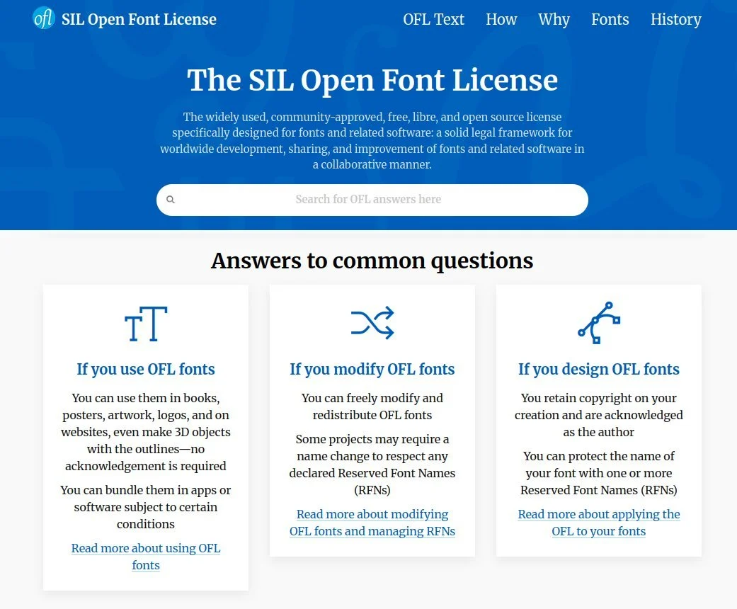
Screenshot of the SIL Open Font Licence home page. Text below the heading reads, “The widely used, community-approved, free, libre, and open source license specifically designed for fonts and related software: a solid legal framework for worldwide development, sharing, and improvement of fonts and related software in a collaborative manner.”
Next I checked our international retail websites and our project and partnership websites, since all of those have their own branding.
I found that on the websites we directly manage, we use these typefaces:
So no issue there.
And on the websites our partners manage, we use these typefaces:
Public Sans, available under the SIL OFL,
Network Sans, a custom font created for the government agency that built the website this is used on so they wouldn’t need a licence, and
Proxima Nova, the only font that does require a licence, except that Monotype doesn’t sell a licence to it.
So no issue there either.
Promotional graphics displaying the Roboto, Asap, Public Sans, Network Sans, and Proxima Nova typefaces.
With those initial checks done, I reached out to our digital team (who build and manage our websites and apps) with a screenshot of the LinkedIn message I’d received and a summary of my investigation. I asked them how they wanted me to reply.
I needed to check with these folks first because my team and I only look after the corporate website. My employer’s overall digital presence – including the back-end of the corporate website – is managed by the digital team.
Turns out a couple of people from the digital and design teams had received identical messages from this Monotype “Business Development Representative”.
A few internal back-and-forth emails later we decided that:
Instead of all of us responding, only one nominated person from the digital team would respond.
But before responding, the digital team would do their own investigation into the fonts we use and the licences we own so we could verify everything was in compliance.
Of course that’s not how things actually went down.
Three-panel meme showing Oprah Winfrey pointing at members of her TV talk show audience apparently shouting, at least according to the text captions at the bottom of each panel, “You get a LinkedIn message!”
What the Monotype rep did next is kind of what a malicious hacker does when they’re trying to get someone from your company to click on a link that’ll install malware on your computer. Over the next couple of weeks, the rep messaged a dozen or so more people from different parts of the business, hoping to hook just one person who would reply to the scary message they were sending.
Now I’d already emailed my design, brand, and digital team colleagues to tell them about this mass-messaging campaign and our plan of action for it, but the Monotype rep expanded their campaign to include people from our procurement team, who I hadn’t thought to forewarn.
So not long after, I received a message from one of my procurement team colleagues who’d been forwarded that LinkedIn message from their senior manager with an instruction to deal with this. I explained to my colleague that, as far as I could tell, this Monotype campaign was similar to the domain name scams the procurement team is already familiar with. So please sit tight till our digital team colleagues have completed their audit and then we’ll figure out which one person should start the conversation with Monotype.
But, like any successful phishing campaign, the Monotype rep’s LinkedIn messages eventually reached someone who did respond. This was another person in the procurement team and, just to be completely clear, I don’t blame them for responding. They were just doing their job of protecting our business from potential copyright liability.
Since I’d handed this over to the digital team, I hadn’t kept track of how things were progressing. I was brought back into the discussion when our brand manager included me in an email thread between her and the procurement person who’d responded to Monotype.
I quickly brought this second procurement person up to speed with our earlier plan of action and then I looped in the digital team again. Turns out the digital team had completed their audit, found that we were in compliance, but had gotten busy with other work so no one had responded to Monotype. *sigh*
Screenshot from the TV series ‘Star Trek: The Next Generation’ showing the character of Captain Jean-Luc Picard sitting in the captain’s chair with his hand covering his face, typically referred to as a “face palm” gesture.
Now, of course, everyone was on the back foot because our new procurement rep had shared the PDF that Monotype had sent, listing all the places where we were using Monotype fonts without a proper licence.
And, to quote from the procurement rep’s email:
Supplier has confirmed two options:
Past Use License Agreement is used (PULA) to cover the usage for the period without a license if the software is to be removed.
Process the PULA with a Go Forward license agreement to allow compliant continued use of the fonts in use.
Reading that, I got this procurement rep to quickly convene a meeting with everyone involved, though it turned out the person from the digital team who’d done the font audit had gone on annual leave.
The rest of the digital team didn’t know anything about font licencing and this was the first time this procurement rep was dealing with font licencing as well. So, partly spurred on by their senior manager’s instruction to deal with this, the procurement rep was seriously considering paying the licencing fee that Monotype had asked for, just to make this whole headache go away.
This is where I jumped in and told everyone to hold up. I said I would take the lead on this internally and I would take over the discussion we were having with Monotype as well. The procurement rep, I think somewhat relieved to have this taken out of their hands, agreed.
Why did I insist on taking this over? Two reasons:
I’m a bit of a typography nerd so I know what I’m talking about and
a quick look at the document Monotype had sent over with the list our alleged copyright infringements had told me that everything the Monotype rep was alleging was wrong.
Screenshot from the film ‘Star Wars: The Rise of Skywalker’ in which the character Luke Skywalker is saying, “Amazing. Every word of what you just said was wrong.”
An April 2025 blog post from Studio Twofold’s Jamie Walker titled ‘Unlicensed Fonts: The Hidden Risk in your Branding’ opens with:
Lately, we’ve seen a noticeable uptick in copyright issues related to both images and fonts. Several clients have reached out after receiving emails about fonts [an] agency used on their site years ago.
Naturally, they’re a bit rattled — and with good reason. These kinds of copyright claims can come with hefty fees if you’re found to be in breach.
Further down Jamie writes:
Smaller businesses can get caught off guard — and with AI now scanning the web for even the tiniest copyright infringements, it’s more important than ever to stay protected.
Think they’re only picking on the small guys? Think again. Even giants have been caught out – proving no one is too big to face the music (or in this case, the typography).
Basically, the reason so many organisations are getting out-of-the-blue copyright claims these days is because major copyright holders have started using automated, AI-powered copyright infringement detection software, of which there is a lot out there. *sigh*
Monotype seems to have used one of these products too, because the two fonts its report claimed we were using without a valid licence are:
Credit Cards in our iOS and Android apps and
Proxima Nova in one of our project websites.
Let’s take those one at a time, shall we?
Screenshot from the film ‘The Princess Bride’ in which the character Inigo Montoya is saying, “Let me explain. No, there is too much. Let me sum up.”
The first thing I did as I read the report was look up the Credit Cards font on MyFonts.com, Monotype’s online store front.
Credit Cards is a pictogram font that contains these icons:
Screenshot from the MyFonts.com website showing the glyphs contained within the Credit Cards font.
When I saw that I thought to myself, “Why would we want to use those icons in our apps?”
Next I read Monotype’s report in detail and saw this screenshot. This is from an analysis of our app’s payload and is the apparent proof that Credit Cards is being used in our smartphone apps:
Screenshot of a table in a PDF file showing a 70 kilobyte size font file with the extension TTF and the filename, “CREDC” followed by three underscore characters.
Having worked with a great many font files over the years, when I saw that filename I thought to myself, “Are we sure that’s actually the Credit Cards font that Monotype claims it is?”
So I checked. I did a web search for fonts with “credit card” in their name and very quickly found one called ‘Credit Card’ – singular – from K-Type. This is a regular text font (as opposed to an icon font) that looks like the raised text that’s printed on credit cards.
Screenshot from the K-Type website showing the description and sales page of a font named Credit Card. The description starts with, “Credit Card is an all capitals font for simulating bank cards.”
Now that I was something I could see us using in our apps.
Happily, Credit Card is free for personal use so I downloaded it and looked at the zip file. And guess what the filename of the font is?
Screenshot of software showing the contents of a zip file. A file among this list is highlighted. Its name is “CREDC” followed by three underscore characters. It has the extension TTF and is approximately 70 kilobytes in size.
Yup, the filename is CREDC___.ttf – which is exactly the filename that was in the app payload analysis from Monotype.
Seeing this, I reached out to my design team contact who then got me in touch with the person who manages our smartphone apps. From them I found out that, sure enough, the only font over and above Open Sans that we use in our smartphone apps is Credit Card by K-Type.
SCORE: Ameel 1, Monotype 0
Unlike the Credit Cards font, our use of Mark Simonson’s Proxima Nova was never in contention. We clearly use it in one of our project websites. My employer didn’t actually build that website – we bought this under-construction project from another entity – but this website is very much our responsibility now.
The problem for Monotype here was that it no longer sells licences to Proxima Nova. There was a time you could buy a licence to Proxima Nova from Fonts.com, which was Linotype’s online marketplace. But Monotype bought Linotype and eventually killed off Fonts.com and, some time after that (I don’t know when or why), the font’s designer stopped selling licences to Proxima Nova through MyFonts.com.
Screenshot from the MyFonts website showing a page with an error message that reads, “The font is no longer available for purchase”.
Of course learning this fact didn’t mean that I was just going to stop my investigation. I reached out to a person, who reached out to a person, who reached out to the design agency that designed (and still maintains) our project website. The design agency contact did their own investigation and quickly confirmed that, yes, they do indeed have a licence to use Proxima Nova on this site – one that they had purchased from Adobe several years ago.
SCORE: Ameel 2, Monotype 0
Armed with this knowledge, I got the procurement person to introduce me to the Monotype rep. The rep and one of their colleagues were very eager to talk, replying to this introductory email within fifteen minutes. They wanted to organise a meeting so they could finally get the font licencing agreement signed. Instead what they got was a long email from me in which I explained the situation in detail, complete with annotated screenshots like the one above :)
The Monotype rep chewed on this for a few days and then made one final attempt at getting money out of us. They agreed that they were currently unable to sell a licence to Proxima Nova, but it turns out Monotype is one of K-Type’s authorised resellers and [they] “currently cannot see the license on our files for this use” – meaning there wasn’t a record of us purchasing a licence to Credit Card from Monotype. So could we please “confirm if there is one that we for some reason are unable to see in our systems?”.
*sigh*
I wrote back and told them the reason Monotype doesn’t have a record of this licence is because we purchased a one-off Enterprise Licence directly from K-Type several years ago.
This was several weeks ago and I haven’t heard a peep from them since.
¯\_(ツ)_/¯
Graphic showing cracked green paint on pavement on top of which white coloured text has been overlaid. The text is a quote from Ben Goldacre that reads, “I think you’ll find it’s a bit more complicated than that”.
Despite my making light of the situation, I don’t actually hate Monotype for doing this. Using fonts without purchasing a proper license (or purchasing the fonts outright) is stealing and you absolutely should not do it.
The fact that font licensing can be a complicated issue is not an excuse; lots of things are complicated and we figure them out.
More importantly, I think the type designers and type foundries that create fonts should be fairly compensated for their work. Paying for fonts, or an ongoing licence to those fonts, is how you do that.
In short, you should pay for fonts and you should call out people and organisations when they use fonts without a proper licence.
(For completeness’ sake, I should say that I also don’t mind that Monotype used automated systems to find copyright violations. The internet is so large that it’s impossible to manually find all the people who have stolen your stuff!)
That said, I hate how Monotype’s business development people went about doing this. Much like the blatantly overzealous content blockers on YouTube, the Monotype reps who reached out to us didn’t even bother to verify whether the report their AI spat out at them showed an actual copyright violation or not.
I mean, I know why they didn’t double-check. Just like with scammers and phishers, this is a volume game, not an accuracy or fairness game. You bombard people with messages, scaring them with your (potentially unverified) claims, and eventually some of the thousands of people you’ve messaged will reply. You then rush these folks into paying a licence fee because your targets don’t have enough information about font licencing and, frankly, they just want the problem to go away. This is a shitty way to do business and it reflects poorly on your organisation.
Screenshot from the Nebula.tv website showing a documentary with the title ‘Nebula Sans’. The short description of this documentary reads, “The story of a font built on principle, free to use for anyone who needs it.”
Not that reputation seems to matter too much to popular digital marketplaces – Amazon being the poster child for this. They’re big, they’re arguably enshittified, and all they appear to care about is making as much money as possible.
I mean there’s a reason why so many type designers urge people not to licence fonts – even their own fonts – from MyFonts and instead buy or licence fonts directly from designer and type foundry websites. And, barring that, buying or licencing fonts from smaller, independent stores like Fontspring instead.
This is also why TypeType and Fontstand offer font subscriptions that are alternatives to those from Adobe Fonts and Monotype.
And this is why, for example, the independent video streaming site Nebula was forced to design their custom Nebula Sans font. Nebula’s website and streaming apps used to use the Screen Smart version of the Whitney font from Hoefler&Co. But when Monotype purchased Hoefler&Co, the new Monotype licencing/royalty structure meant that a licence to Whitney was suddenly unaffordable to Nebula. Since paying that (apparently much) higher amount to Monotype wasn’t going to be financially sustainable, Nebula instead paid Paul D. Hunt, the original designer of the excellent Source Sans font, to modify his font so it would be a drop-in replacement for Whitney in all of Nebula’s digital products. And because Source Sans was released under the SIL Open Font License, Nebula also released Nebula Sans under this OFL.
If that’s how much effort folks are willing to make to to avoid using your company, you probably already know that you’re not very well loved.
Screenshot of a website banner that shows the date range, “November 6 – December 4” and reads, in fancy, bright-pink, all capital letters, “cyber sale” and, “shop now”.
So what’s my take-away from all this?
Don’t use scammy tactics to scare people into purchasing your shit. And if you are going to use those tactics, at least don’t be wrong about it!
If anything like this happens to you or your employer, find the relevant nerd in your friend group or organisation and ask for their help.
If you can, avoid licencing fonts from Monotype. Get your fonts directly from the original designers and type foundries, or maybe from smaller, independent marketplaces like Fontspring (which has its big annual “cyber sale” on till 4 December, by the way).
If you’d rather avoid the hassle of font licencing altogether, then do what my employer did and pick an excellent, versatile OFL font and use that instead. Though, if you want to stand out from the crowd, please consider avoiding the most popular fonts on Google Fonts.
Oh, and while I’m far from an expert on typography, if you need a hand with anything font-related, please reach out. I’d be happy to help in any way that I can :)
In my last post I talked about being forced to drop Sync.com as my cloud file synchronisation solution when I moved to Linux because Sync doesn’t have a native Linux client. (I now use the excellent, cross-platform Tresorit, fyi.)
You know what I didn’t have to drop when I moved to Linux because it does have an excellent Linux client? Joplin, my open-source, cloud-synchronised note taking solution.

These are all the tools I use to keep my thoughts, notes, lists, tasks, and bookmarks synchronised across my four primary personal devices (desktop computer, laptop computer, tablet, and smartphone) and, when needed, my two work devices (laptop computer and work smartphone).
The primary tool I use to capture all my thinking, planning, researching, documenting, and cataloguing is Joplin (created and maintained by London-based developer Laurent Cozic).
I love Joplin because:
it’s free (though I support its development via a Patreon membership),
it’s open source (at least the desktop client is),
it’s cross-platform (yay Linux client!),
it lets you use a range of back-end cloud storage options to sync your notes (otherwise at heart it’s an offline-first note-taking app),
it lets you use Markdown to structure you text, and
it provides end-to-end encryption (E2EE) for all you notes.
Unlike a lot of other, and perhaps, more popular note-taking tools – the commercial kind that you have to pay for – Joplin isn’t trying to be the everything-tool for everyone. It does a few things, and it does those well. It is relatively uncomplicated and its apps are all lightweight.
I especially like that you can choose among a bunch of cloud storage options to store and sync your notes in the back end. I already have 1TB of space on OneDrive (through our Microsoft 365 Family subscription) so I use that to sync my notes. And since all my notes are end-to-end encrypted, I have no security or privacy concerns with using OneDrive’s cloud storage for this purpose.
(Joplin has since launched Joplin Cloud to provide its own back-end cloud note-syncing functionality. This back-end synchronisation server is the only part of Joplin that’s not open-source.)
I use Google Keep because it consistently has the fastest and most reliable note synchronisation. Also, its lightweight apps works brilliantly on Android, iOS, and the web.
Content in Keep is (surprisingly for Google) private, but I don’t save anything secret here because your notes can still be subpoenaed.
KanbanFlow is a simple, lightweight kanban board / project management tool from CodeKick out of Gothenburg, Sweden.
I don’t use this for project management though, I use it to maintain the lists of books, TV series, and movies I want to watch next. (I’ve written about this use case before, if you’re interested.)
If I did need a project management tool though, I’d switch to the paid version of KanbanFlow.
(Trello used to be my preferred kanban tool but its developers kept adding features I didn’t want or need, to the point that it was no longer a fun, easy, lightweight web or smartphone app to use. It got even more complicated to use after Atlassian purchased it and added it to their suite of team-oriented products.)

Nadia and I have tried a bunch of list-making apps over the years, but Microsoft’s To Do is the simplest, most convenient, and most reliable of the lot.
(Our Family subscription to Microsoft 365 is why this app was even an option for us in the first place, by the way.)
Pinboard is an incredibly simple, very fast, and super efficient, web-based bookmarking tool that lets you bookmark webpages and, importantly, tag them for easy indexing.
It also has an ‘unread’ tag that lets you use this as a place to store all your read-later links. My read-later app of choice used to be the now-defunct Pocket, but I switched to Pinboard a few years ago and never looked back.
(For completeness’ sake I should mention that I use Firefox and Vivaldi browser accounts to sync my day-to-day web bookmarks, browsing history, and browser settings.)
I use the amazing, open-source Bitwarden to generate, store, and sync all my passwords and the fantastic, open-source Aegis Authenticator to generate all my time-based one-time passcodes (TOTP).

Growing up I captured my notes, thoughts, and shopping lists using paper notebooks, notepads, and lined notepaper that I stored and organised in ring binders (complete with dividers and colour-coded tabs).
Once I got a job and stopped needing to carry ring binders around, I took notes on nicer notebooks from Moleskine, Leuchtturm 1917, and Field Notes. These paper-based methods saw me through my bachelors degree, masters degree, several jobs, and even my bullet journaling era (like in the scanned page above).
These days its easier to carry only a smartphone in your pocket instead of also carrying a notepad and pen with you everywhere. I’m more digital than most people, so it was inevitable that my note-taking would go all-digital sooner rather than later.
That switch happened in 2010 when I got an Evernote account and moved all my note-taking online. I loved Evernote because I could easily organise, index, and search through my notes. I could also access all of my notes, all of the time, regardless of where I was and which digital device I happened to be using.
Evernote was great in those early days so I signed up to a Premium subscription in 2012. I loved using it for everything from note taking, to cataloguing recipes, to saving blog posts and newspaper articles for later reading,
But as its desktop, web, and smartphone apps became increasingly complicated, bloated, and slow, the less I wanted to use it.
Evernote eventually went down the enshittification route so I dropped it altogether, as did many others.

I tried Microsoft’s OneNote for a while because I’d bought a tablet PC and OneNote let me take hand-written notes (using the stylus) on its desktop version – like in the screenshot below.
However OneNote didn’t have cloud sync to begin with, and when that functionality did arrive, is wasn’t particularly good, so I stopped using this too. (It was also always slower than Evernote and too unstructured for my liking anyway.)
For a while I also explored taking all my notes in Google Docs and storing everything in a specific note-taking folder. This worked fine for some longer, more complicated notes, but it was never convenient for everything. Google Docs is optimised for document writing, not simple note taking, after all.
Eventually I found Joplin, fell in love with it, and then migrated all my personal notes over in January 2020. I haven’t found, or even needed to look for, a better alternative since.
Funnily enough, a version of that notes-in-Google-Docs idea is what I ended up adopting for note-taking at work. For several years now I’ve been taking all my work notes in plain old text files that I edit using Notepad++ and store in my work OneDrive.
I use a combination of four text files:
tasks.txt, in which I maintain a list of daily, weekly, quarterly, and yearly tasks for myself and my team
coordination.txt, in which I jot down my meeting notes
projects.txt, in which I write notes about the large projects I’m working on
people.txt, into which I take notes during the one-on-one meetings I have with my manager and my direct reports
Every Monday I create new versions of those text files (with Monday’s date in the filename), deleting notes from previous weeks that I no longer need for my current work. This way my active files remain short and focused, and it’s still pretty easy for me to search through earlier weeks’ files if I need to find something older.
(I used to use Trello at work for tracking personal tasks, coordinating team tasks, and for managing team projects, but our IT team “rationalised” our suite of tools and now we’re stuck with Microsoft Planner which is…not great.)

I said I haven’t felt the need to look for Joplin alternatives, and that’s true, but I did play around with Standard Notes for a little while. This is a paid service that I thought might be a good, E2EE alternative to Google Keep. Unfortunately it was slow to sync and its app was glitchy on my phone so I didn’t trial it for long.
And before you ask, I’ve never bothered with tools like Notion, Obsidian, Logseq, and their ilk. Those are all too complicated – they’re a “knowledge base”, a “workspace”, and other fancy descriptors like that – plus I feel paid apps like Notion will eventually go down the enshittification route, just like Evernote did. Notion is already touting itself as the “the AI workspace where teams and AI agents get more done together”. Ugh.
To summarise, these are the tools I use:
Long, secure notes: Joplin (plus OneDrive for back-end storage and sync)
Short, casual notes: Google Keep
Kanban board: KanbanFlow
Shopping and other lists: Microsoft To Do
Bookmarks and read-later links: Pinboard
Passwords and TOTP: Bitwarden and Aegis Authenticator
Oh, and I use plain old text files (using Notepad++) for taking notes at work.
It’s taken me a while to get to where I am and I’m very happy with the set of tools I’ve settled on.
Do you have a primary note-taking tool? If so, what is it? I’d love to know.
I’ve been wanting a wide-angle camera lens for a while, but I didn’t need one enough to justify spending serious money to buy it. [1]
Happily, the folks from TTArtisan released their AF 14mm F3.5 prime lens (21mm full-frame equivalent) with a Fujifilm X Mount a few months ago and I just bought one for myself when it went on sale :)
Here are the photos I took with this lens during a recent walk Nadia and took around the northern suburbs of Melbourne.
Wide-angle photo of a public barbecue and a rectangular gazebo that's covering a table and two benches. This barbecue area has been built right next to a children's play area.
Wide-angle photo of playground equipment in a local park. The equipment consists of poles, bars, and ladders made out of metal with ropes and handles tied all around them, making for a challenging traverse across to the other side.
Wide-angle photo looking up from the bottom of a bright orange coloured children’s slide in a local park.
Wide-angle photo looking up from the bottom of a bright orange coloured children’s slide in a local park.
Photo of the shaded veranda of a brick building at a local Australian rules football ground.
Photo of a shuttered-closed canteen window at a local Australian rules football ground.
Photo of a shuttered-closed canteen window at a local Australian rules football ground. A printed canteen menu has been attached to shutters on the side of the window, with the title, ‘Hadfield Haws Canteen Menu’ and menu item prices written in whiteboard marker.
Close-up photo of a concrete footpath with a white-coloured ‘slow down’ warning painted on it.
Close-up photo of a concrete footpath with a white-coloured ‘slow down’ warning painted on it. The front of the photographer's black-and-white sneakers are visible in the bottom of the frame.
I really like this lens!
TTArtisan makes solid, low-cost lenses that have an interesting character that (a) I like and (b) works really well for the type of photography that I do.
I now have three TTArtisan prime lenses [2]:
And I’m super happy with all of them! Here’s to many more photos with this lens trio :)
[1] The Fujifilm 16mm prime lens costs around $570 on sale and the Fujifilm 14mm prime lens costs around $1,300 on sale. The TTArtisan 14mm prime lens, on the other hand, costs just under $200 when its not on sale!
[2] I’ll probably (almost definitely) also buy the TTArtisan AF 75mm F2 lens whenever it goes on sale :)
This is personal website of Nadia Niaz and Ameel Zia Khan. Here we document our lives in Melbourne, Australia.
Melbourne, Victoria, Australia